Kendrick Lamar, one of the most influential artists of our time, has reshaped the landscape of hip-hop and modern music. His lyricism, storytelling, and production have earned him acclaim, but it’s also crucial to appreciate the visual components of his work, particularly his album covers. The artwork that accompanies Lamar’s music is not just an afterthought; it’s an extension of his themes, messages, and artistic vision. In this deep dive, we will explore the artistic elements of Kendrick Lamar’s album covers, analyzing their significance, symbolism, and how they reflect his evolution as an artist.
The Importance of Visuals in Music: Setting the Stage
Art has long been intertwined with music, serving as a mirror to the themes explored in sound. For Kendrick Lamar, album covers serve as a vital visual introduction to the auditory journey awaiting listeners. Each cover encapsulates the essence of the respective album, offering a visual representation that resonates with its themes. The blend of imagery, color, and typography works intricately to amplify or contrast with the deeper messages contained within the tracks.
Take, for instance, the cover of his critically acclaimed album To Pimp a Butterfly—an image depicting a group of Black men standing triumphantly in front of a mural of the presidential mansion, juxtaposed with the weight of history. The choice to frame the album this way speaks volumes, conveying a poignant critique of race, power, and identity. The visuals prompt listeners to consider the weight of systemic racism and socio-economic disparities while providing a sense of hope and resilience. Thus, the artistic elements serve not merely as external decoration but as integral components of his storytelling.

A Journey Through Kendrick’s Discography: The Evolution of Album Art
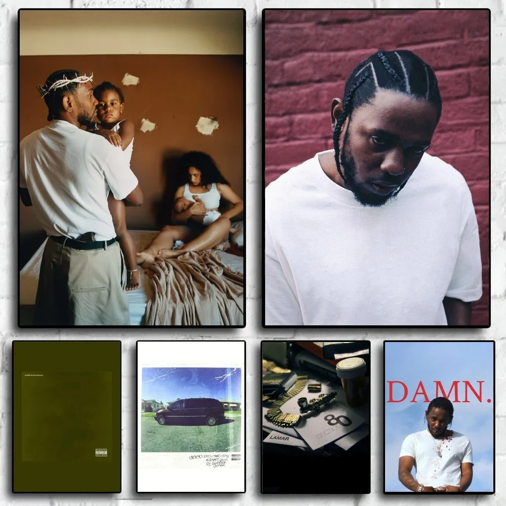
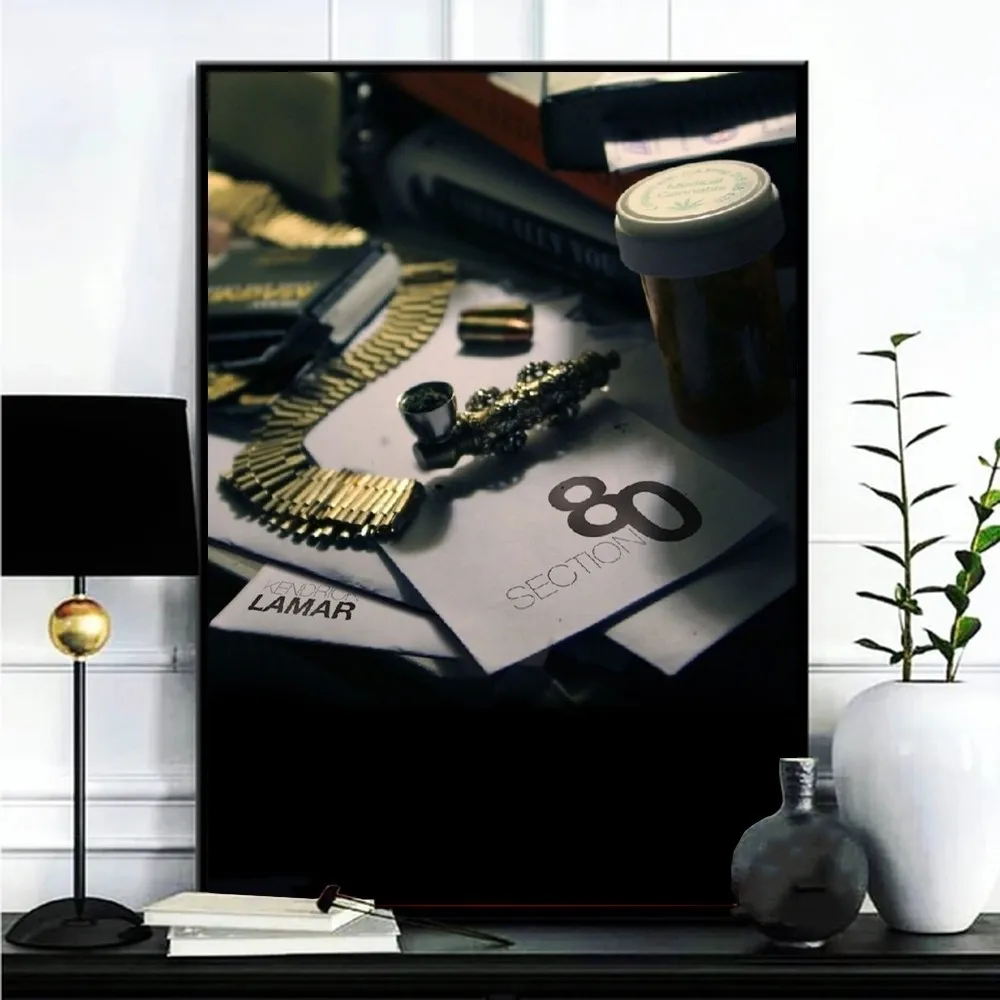
Kendrick Lamar’s artistic journey manifests not only in his music but also through the evolution of his album covers. His inaugural studio album, Section.80, features a distinctive, minimalist cover that channels a vintage aesthetic. The stark simplicity hints at the rawness of his message—gritty and unfiltered depictions of the struggles faced by the youth of Compton. Moving to good kid, m.A.A.d city, the cover art transforms, presenting a stark contrast punctuated by its cinematic quality. The snapshot-like visuals encapsulate the mixtape’s narrative arc, immersing the audience into Kendrick’s world, characterized by both chaos and poetic storytelling.
In To Pimp a Butterfly, the cover art reaches a pinnacle of complexity that intertwines various elements, from the photograph’s historical allusions to the symbolism inherent in the positioning of the figures. Lamar’s use of colors also plays a critical role in reflecting the album’s tone; vibrant greens and earthy browns juxtaposed against dark undertones mirror the complex realities he addresses, from personal struggles to larger societal issues. The latter albums, including DAMN. and Mr. Morale & The Big Steppers, continue this journey of evolution. Each piece of artwork reflects not just his growth as an artist but also his continuing dialogue with sociopolitical issues, personal identity, and cultural critique.

Symbolism: Reading Between the Lines
Kendrick Lamar’s album covers are rich in symbolism, serving as portals into the concepts and themes explored within the music. For example, the cover of DAMN., with its stark red background and the bold, white lettering of his name, evokes a sense of urgency and intensity. The simplicity of the design invites deeper interpretation: the duality of “DAMN” embodies feelings of regret and anger, reflecting the emotional turmoil that characterizes the album. The choice of capitalization, along with the positioning of his name, suggests a confrontational tone, drawing the listener in before they even press play.
Another compelling example is Mr. Morale & The Big Steppers. The cover is layered with meaning, featuring Kendrick himself posing against a backdrop filled with individuals. The blurred figures connote anonymity and universality, hinting at the collective struggles people face. It reflects Kendrick’s deep understanding of personal and collective experiences and suggests the importance of self-reflection while navigating societal challenges. Here, the artistic elements serve a dual purpose: inviting listeners to explore his introspective journey while simultaneously urging them to confront their own mirrors.
Color Theory: The Palette of Emotion
The color palettes employed in Kendrick Lamar’s album covers are essential in evoking specific emotions and guiding the listener’s interpretation of the music. Each color choice is deliberate, often mirroring the album’s themes and lyrical content. For instance, the earthy tones of To Pimp a Butterfly—greens, browns, and yellows—connect not just to the natural world but also signify a return to roots and cultural identity. This thematic connection serves to remind listeners of the historical and generational burdens carried by African Americans, linking the past to the current narrative.
In contrast, the stark white and black found in DAMN. evokes an assertion of clarity amidst uncertainty, crafting a compelling narrative of duality. The use of red in the background heightens the emotional stakes, suggesting urgency and conflict. Kendrick’s art invites viewers to feel as much as think, creating a multisensorial experience that draws parallels between his lyricism and visual storytelling.

Typography and Layout: Words as Art
The typography and layout of Kendrick Lamar’s album covers serve as significant artistic elements, shaping the viewer’s initial impression and framing the thematic content. The decision regarding font choice, placement, and size speaks volumes about the intended message of the album. For instance, the bold, block letters in DAMN. convey authority, echoing the confrontational nature of the album. In contrast, the softer curves found in titles from good kid, m.A.A.d city create an inviting and narrative-driven aesthetic, hinting at the storytelling aspect of the project.
In To Pimp a Butterfly, the arrangement of text integrates seamlessly with imagery, reflecting the continuous dialogue between the visual and auditory components of the album. The hand-drawn style of the word “To Pimp a Butterfly” suggests a raw, organic quality that serves to emphasize the album’s organic narrative structure. Typography, in this context, becomes a branch of the visual language, contributing substantially to the overarching message and emotional impact.
Influences and Collaborations: A Collective Effort
Understanding the artistic elements of Kendrick Lamar’s album covers necessitates acknowledgment of the influences and collaborations that have shaped his vision. Kendrick often partners with talented designers, photographers, and visual artists who understand the depth of his music. For example, the collaboration with director and photographer Dave Free has resulted in some of the most iconic covers in contemporary music, blending visual storytelling with social commentary.
The influence of cultural and historical contexts cannot be overlooked either. Kendrick draws inspiration from his experiences growing up in Compton, California, as well as from broader socio-political movements and art movements. This interplay between his life experiences and the influences from various art forms—such as photography, painting, and graphic design—culminates in covers that resonate with authenticity and relevance.
Cultural Commentary: A Reflection of Society
Kendrick Lamar’s album covers often offer sociocultural commentary, serving as visual extensions of the urgent conversations present in many of his tracks. Particularly in albums like To Pimp a Butterfly, the cover art becomes a canvas for exploring themes related to race, identity, history, and resilience. By positioning collective experiences front and center, the imagery catalyzes discussion while also urging reflection on systemic inequalities.
For instance, the images on the To Pimp a Butterfly cover—a collective group of Black men standing under an iconic historical backdrop—provoke questions about representation, power dynamics, and unity. The art is a rallying cry, encouraging listeners not only to engage with the music but also to reassess their perspectives and roles within society. The artwork encapsulates Kendrick’s role as a cultural conductor, prompting dialogue about race relations, identity, and community.

Conclusion: The Artwork as a Unified Expression
In analyzing Kendrick Lamar’s album covers, it becomes evident that each artwork serves as an essential component of his overall artistic expression. The intricate interplay of symbolism, color, typography, and layout reveals a multidimensional approach to storytelling that extends beyond the auditory realm. Kendrick’s continuous evolution as an artist is mirrored in his visual presentations, echoing themes of resilience, identity, and cultural critique.
The album covers are not mere adornments; they are invitations to delve deeper into the sonic landscapes Kendrick creates. They resonate as part of a collective experience—intertwining personal narratives with broader societal issues. Through each cover design, Kendrick Lamar has masterfully curated the visual aspects of his work, crafting a cohesive expression that engages and challenges listeners, ultimately redefining what artistry means in contemporary music. In embracing the unity of sound and sight, Kendrick has established himself not only as a masterful lyricist but also as a formidable visual artist, forging a lasting impact on both realms.